How does a logo change affect brand image? Social media rebranding, with Instagram as the example
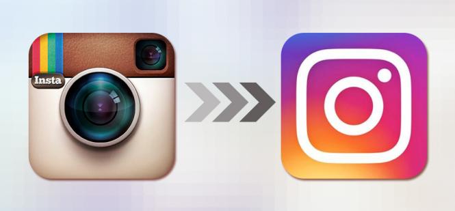
Instagram's logo change stirred up more feeling online than the app's refresh of its entire interface. It looks like the haters of the update outnumber its fans. Does a small icon really matter that much to using an app? A company's logo and its name are the basic identifiers of any brand — the brand that consumers get used to. Instagram, though, isn't afraid of big changes.
In this post
A company's logo and its name are the basic identifiers of any brand — the brand that consumers get used to. Instagram, though, isn't afraid of big changes. Few people remember that this isn't the platform's first rebrand — early in its life it went by “Burbn”. That name change didn't echo anywhere near as loudly as the latest revolution, in an era when the app belongs to Mark Zuckerberg, who has no qualms about putting extreme new ideas into practice.
Why did Instagram change its logo?
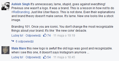
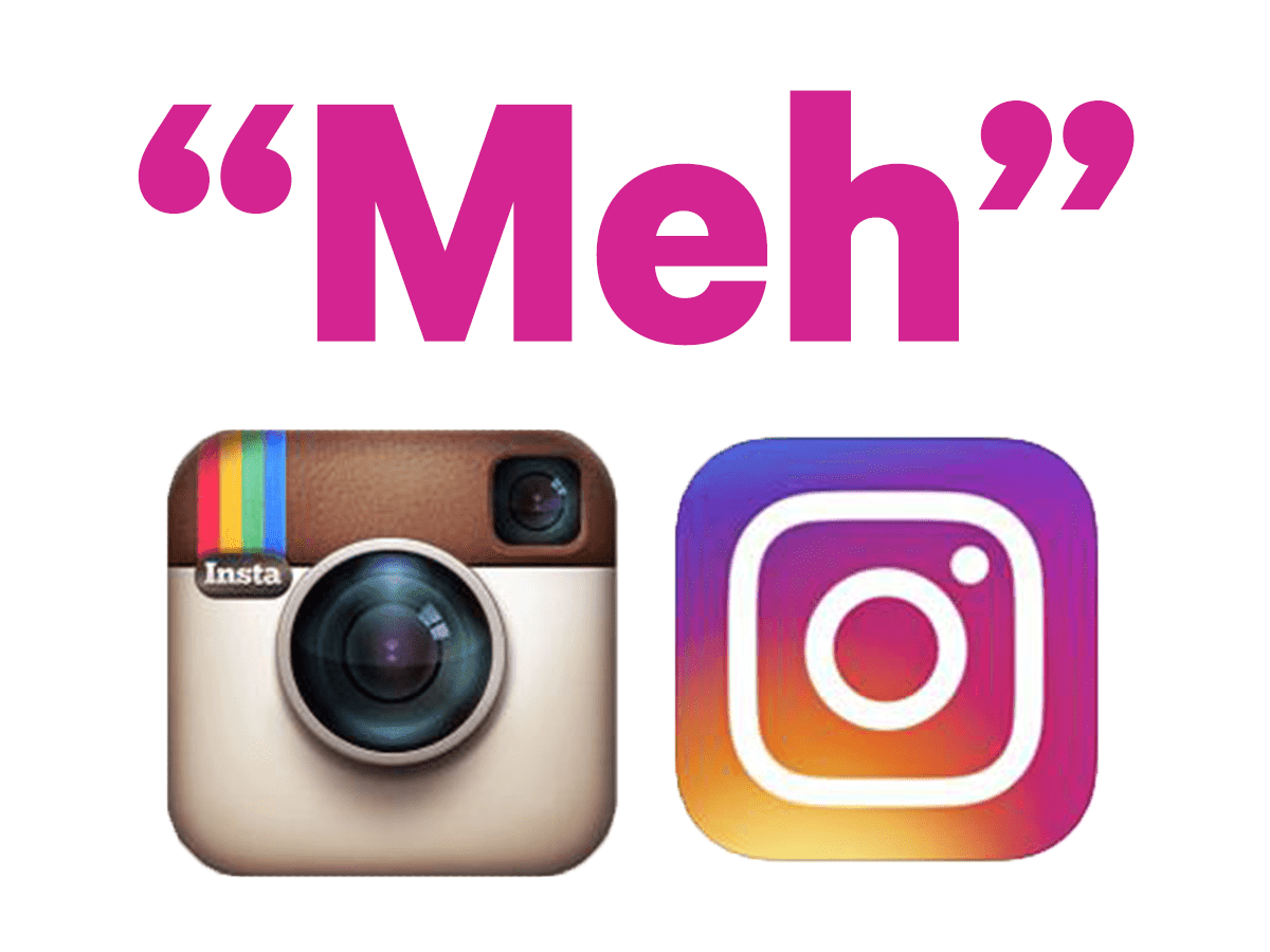
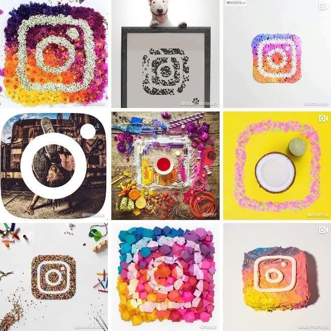
Ian Spalter, Instagram's art director, explains that the logo change is meant to reflect the shifts the platform has been through since it was founded. In its creator's intent, the new flat-design icon points to the trend of instantly photographing everything around us. Now that smartphones are everywhere, it's no longer only about showing off photos online under a filter that styles them as dated, but also about telling stories with those photos. To get there, Spalter used an unusual method to arrive at the new symbol. He asked his colleagues to draw the existing logo in 10 seconds. Most of them managed to sketch a lens and a small black viewfinder, so those elements were kept in the refreshed version. The new logo is more pared back now, symbolic even, which its creator says calls to mind not only traditional cameras but also the smartphones we use day to day to capture moments on a screen. Spalter explains that “the new logo is closer to how people use cameras today”. Most users don't agree with that premise. For opponents of the update, the association with retro photography was exactly what marked the platform out. Beyond that, the excessive simplicity doesn't speak to them — they hold that, unlike the new one, the old logo was detailed and showed off real skill on the designer's part. The internet reacted to the rebrand in a flash. A few examples of the response to the new logo below:
What did the new identity look like?

VIDEO
Did the rebrand work?
If we had to call it right now: at first blush, Instagram's rebrand didn't look like a good way to deepen the relationship with its existing users. Users didn't appreciate the show of growth and modernity, but it certainly got their attention. There was no missing word of the new icon while browsing the news online, even for people who don't follow social at all. It's worth adding, though, that users of social channels get used to change remarkably fast — proof being that within a few days of the rebrand the subject of the new logo had been forgotten, along with the platform's old icon.
 MarketingSocial LamaInfluencer vs. UGC creator – what's the difference?In online marketing we keep running into the terms “influencer” and “UGC creator” (User-Generated Content). Both roles revolve around making content, but they differ in their goal, their scope, their relationship with brands and the way they reach an audience. Choosing between an influencer and a UGC creator comes down to a company's marketing strategy. What is an influencer? An influencer is someone who builds their own community on social media and, thanks to that recognition, influences what their followers decide to do.READ POST
 Marketing
 Łukasz PłocińskiCan your Instagram posts show up in Google results?Can your Instagram posts show up in Google results? Until recently that was rare, but the breakthrough has arrived. As of July 10, 2025, Instagram officially lets Google index public content from professional accounts (business and creator). That means photos, videos and Reels from those accounts can turn up in Google – alongside websites, blogs and YouTube videos.READ POST
 MarketingSocial LamaThe best Instagram hashtags to grow your reach on social mediaHashtags on Instagram are one of the most effective ways to grow your reach and get in front of new audiences without paying for ads. According to the latest research, posts with well-chosen hashtags can pull up to 70% more reach than posts with no tags at all. In a world where Instagram's algorithm keeps getting stricter, using hashtags well can be the key to a successful social media strategy.READ POST